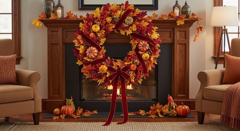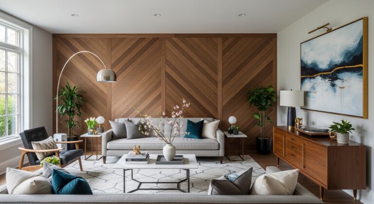
22 Vibrant Wall Color Palettes for Stylish Homes
Transforming your living space starts with the perfect wall color palette. Whether you’re drawn to calming neutrals, energizing brights, or sophisticated monochromes, the right combination can completely reimagine your home’s atmosphere. Paint colors influence mood, perception of space, and overall aesthetic appeal. This curated collection showcases twenty-two stunning wall color palettes that work beautifully across different rooms and design styles. From coastal-inspired blues to earthy terracotta tones, you’ll discover combinations that reflect your personality while creating spaces you’ll love coming home to every day.
Sage Green and Cream Serenity
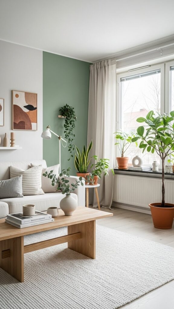
This calming palette brings nature indoors with its soft, organic feel. Sage green walls paired with cream trim create a peaceful sanctuary that works beautifully in bedrooms, living rooms, or home offices. The muted green tone provides visual interest without overwhelming the space, while cream accents add warmth and light. This combination pairs wonderfully with natural materials like rattan, jute, and light wood furniture, creating an effortlessly sophisticated look.
The versatility of sage and cream makes it perfect for various decorating styles, from farmhouse to contemporary. This palette creates an excellent backdrop for both colorful accessories and neutral decor pieces. Layer in warm metallics like brass or gold for added elegance, or introduce terracotta and rust tones for an earthy, grounded feel. Plants thrive against sage green walls, their foliage creating beautiful textural contrast that enhances the nature-inspired atmosphere throughout your space.
Navy Blue and White Nautical
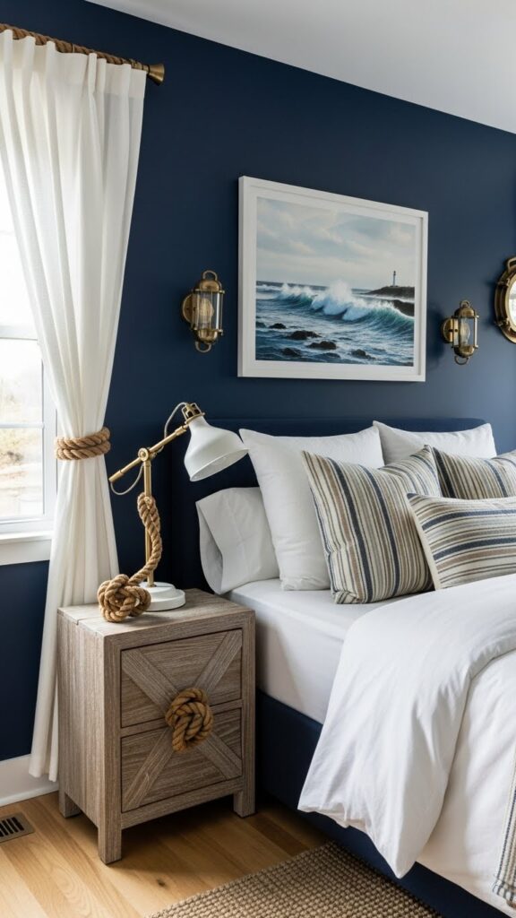
Navy blue brings depth and sophistication while maintaining a fresh, clean aesthetic when paired with crisp white. This classic combination works exceptionally well in bedrooms, bathrooms, and coastal-themed spaces. The rich navy creates a cozy, enveloping feel without making rooms feel small or dark, especially when balanced with generous white trim, furniture, and textiles. Natural light enhances the contrast, making spaces feel both intimate and airy.
This timeless palette adapts beautifully across seasons and trends, ensuring your space won’t feel dated. Introduce natural textures through jute rugs, linen curtains, and weathered wood accents to soften the boldness of navy walls. Metallic touches in brass, bronze, or polished nickel add refined elegance. For visual interest, incorporate patterns like stripes, geometric designs, or botanical prints that blend both colors, creating cohesive flow throughout your room.
Warm Terracotta and Cream
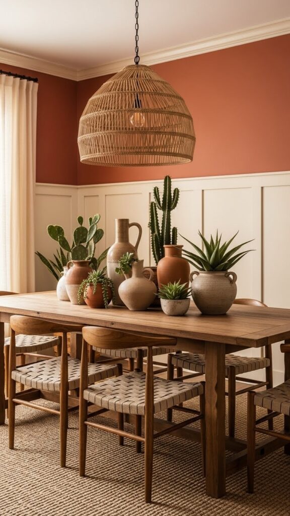
Terracotta walls infuse spaces with warmth and earthy elegance reminiscent of Mediterranean villas and desert landscapes. Paired with soft cream, this palette creates inviting, sun-drenched rooms perfect for gathering spaces like dining rooms and kitchens. The orange-brown undertones of terracotta add richness without feeling heavy, while cream provides necessary breathing room. This combination works wonderfully in homes with abundant natural light, where the terracotta glows beautifully throughout the day.
Layer this palette with natural materials to enhance its organic appeal. Incorporate woven textiles, clay pottery, and wooden furniture in warm honey or walnut tones. Plants with sculptural forms like cacti, succulents, or olive trees complement the earthy aesthetic perfectly. Add depth through varied terracotta shades, from burnt orange to dusty rose, creating subtle tonal variations. Brass or copper accents introduce warm metallic notes that elevate the overall sophisticated yet relaxed atmosphere.
Soft Blush Pink and Gray
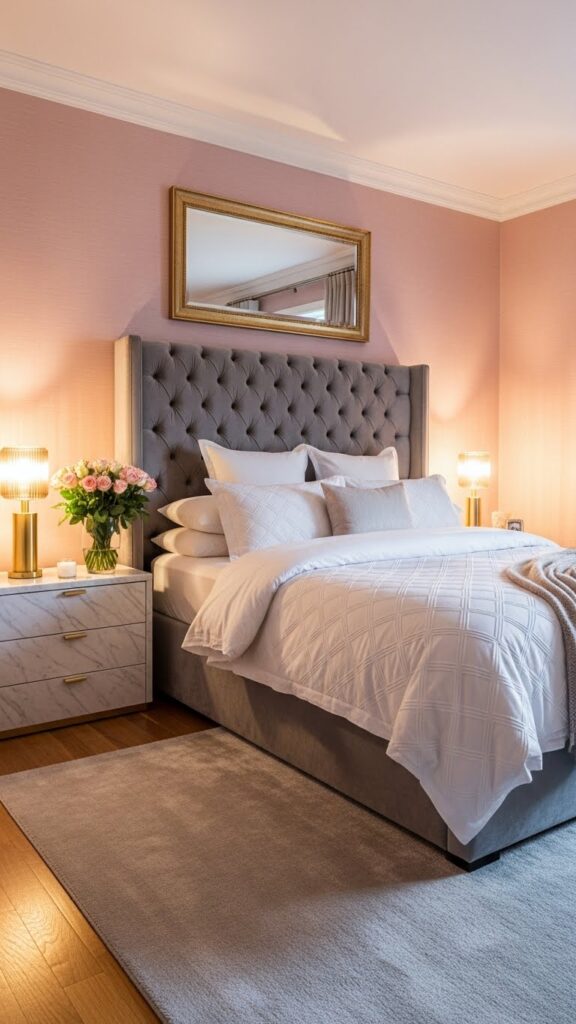
This sophisticated palette combines feminine softness with modern restraint, creating spaces that feel both romantic and contemporary. Blush pink walls provide gentle warmth while gray furnishings and accents ground the sweetness, preventing it from feeling overly saccharine. This combination suits bedrooms, dressing rooms, and powder rooms beautifully. The subtle pink creates a flattering, warm glow that makes skin tones appear radiant, while gray adds necessary structure and visual weight.
Balance is key when working with blush and gray. Use varying shades of gray from pale dove to charcoal to create depth and dimension. Introduce white elements through trim, bedding, or furniture to keep the space feeling fresh and airy. Metallic accents in rose gold, champagne, or silver enhance the refined elegance. Velvet, silk, and linen textures add luxurious tactile interest. This palette provides the perfect backdrop for both minimalist and maximalist decorating approaches.
Forest Green and Mustard Yellow
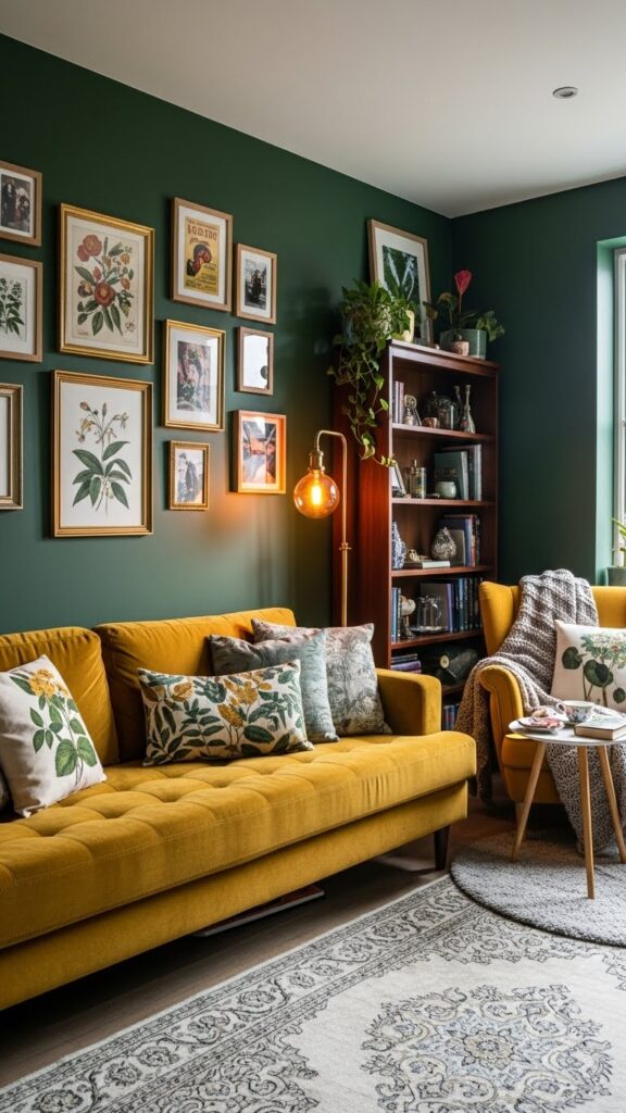
This bold, nature-inspired combination brings vibrancy and personality to living spaces. Deep forest green walls create a cocooning effect that feels both dramatic and grounding, while mustard yellow accents inject cheerful energy. This palette works exceptionally well in living rooms, libraries, and creative spaces where you want to inspire conversation and creativity. The richness of both colors creates an enveloping atmosphere perfect for intimate gatherings and quiet evenings.
The key to mastering this palette lies in balancing the intensity of both hues. Use mustard strategically through furniture pieces, throw pillows, or artwork rather than overwhelming the space. Introduce natural wood tones and brass fixtures to bridge the colors harmoniously. Plants with varied green foliage add textural depth against forest green walls. Layer in cream or ivory elements to provide visual rest points. This combination pairs beautifully with vintage and bohemian decor styles.
Powder Blue and Soft White
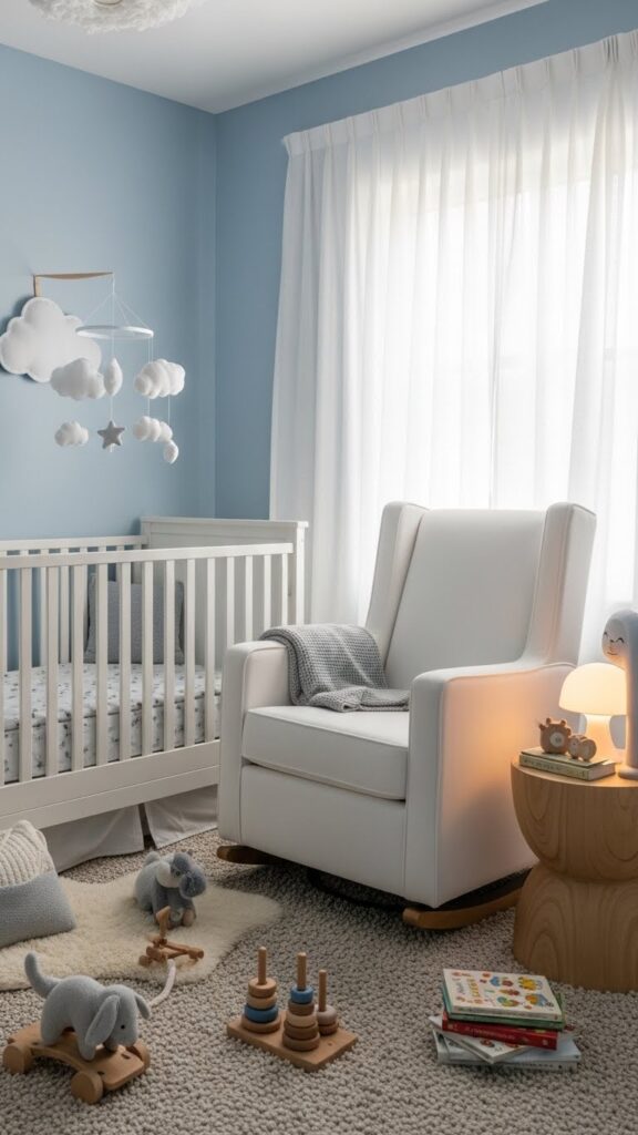
Powder blue creates tranquil spaces that feel airy and expansive when combined with soft white. This gentle palette works beautifully in bedrooms, nurseries, and bathrooms where relaxation is paramount. The light blue tone evokes clear skies and calm waters, promoting peaceful, restorative environments. Unlike stark white, soft white adds warmth while maintaining brightness, creating spaces that feel inviting rather than clinical or cold.
This versatile combination adapts to various design styles from traditional to contemporary. Layer different textures through linen curtains, cotton bedding, and woven baskets to add depth without introducing additional colors. Silver or brushed nickel hardware complements the cool tones perfectly. For subtle interest, incorporate patterns like delicate florals, subtle stripes, or geometric designs that blend both colors. Natural wood furniture in light oak or whitewashed finishes enhances the airy, Scandinavian-inspired aesthetic.
Charcoal Gray and Warm Beige
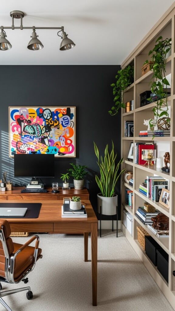
This sophisticated palette balances modern edge with approachable warmth, perfect for creating professional yet comfortable spaces. Charcoal gray walls provide a dramatic backdrop that makes artwork and furnishings pop, while warm beige elements soften the intensity. This combination excels in home offices, dining rooms, and entryways where you want to make a strong first impression. The darker gray adds architectural interest and helps define spaces in open floor plans.
Prevent this palette from feeling cold by incorporating plenty of warm-toned woods, leather, and textured fabrics. Brass, bronze, or warm gold fixtures add luxurious touches that complement the beige beautifully. Layer various shades of both gray and beige throughout the space for depth and sophistication. Introduce greenery to add life and color contrast. Adequate lighting is crucial with darker walls—combine ambient, task, and accent lighting to ensure the space feels welcoming and functional throughout the day.
Coral and Teal Contrast
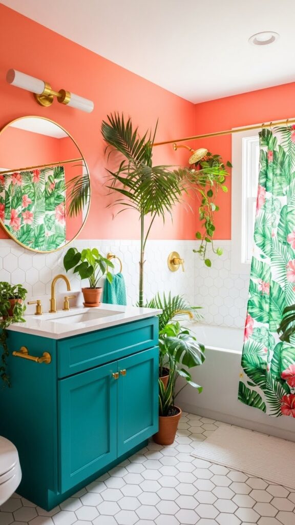
This energizing palette brings tropical vibrancy into your home with complementary colors that create visual excitement. Coral walls radiate warmth and optimism while teal accents provide cooling contrast and depth. This bold combination works wonderfully in bathrooms, kitchens, or accent walls where you want personality without committing entire rooms. The interplay between warm coral and cool teal creates dynamic balance that feels both playful and sophisticated.
Successfully implementing this palette requires restraint and strategic placement. Use one color dominantly on walls while featuring the other through furniture, accessories, or smaller elements. White or cream grounds the intensity, preventing visual overwhelm. Natural materials like rattan, wood, and stone add organic elements that soften the boldness. Gold or brass metallic accents bridge the warm and cool tones beautifully. This combination particularly shines in spaces with good natural light.
Lavender and Cream Dream
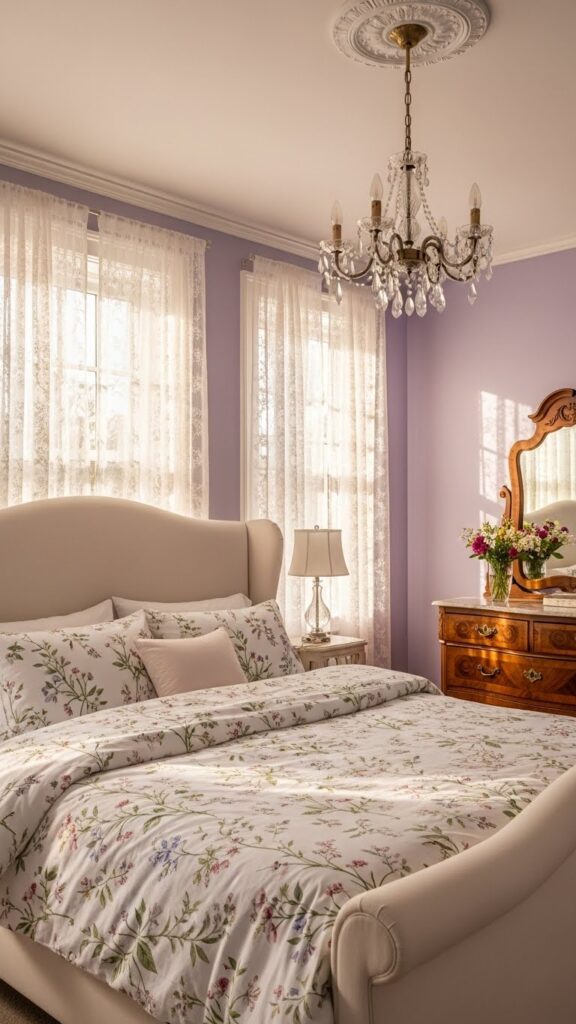
Lavender walls create ethereal, calming environments that promote relaxation and creativity. Paired with cream, this gentle palette suits bedrooms, meditation spaces, and creative studios beautifully. The purple undertones in lavender add just enough color interest without overwhelming, while cream provides necessary warmth and light reflection. This combination creates spaces that feel both serene and inspiring, perfect for unwinding or engaging in thoughtful activities.
This palette lends itself beautifully to vintage, shabby chic, and romantic design aesthetics. Layer various textures through velvet, linen, and lace to create depth and tactile interest. White or ivory furniture keeps the space feeling fresh and prevents the lavender from becoming too heavy. Silver, crystal, or brushed nickel accents enhance the dreamy quality. Introduce deeper purple shades through accent pillows or artwork for added dimension. Fresh or dried lavender in vases reinforces the color story naturally.
Olive Green and Burgundy
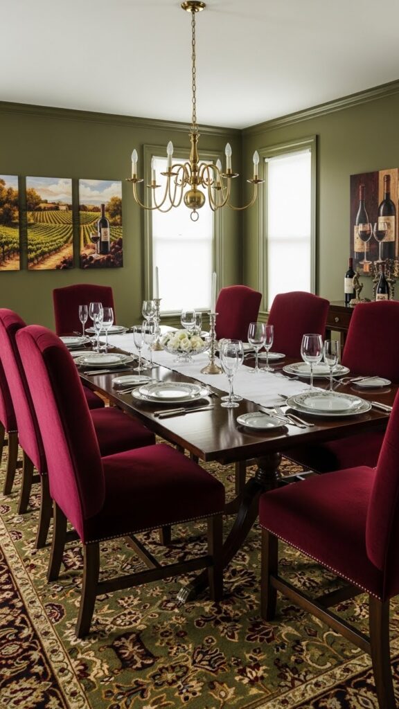
This rich, sophisticated palette evokes classic European interiors with its deep, jewel-toned combination. Olive green walls provide an earthy, grounded base while burgundy accents add luxury and warmth. This pairing works exceptionally well in formal dining rooms, libraries, and traditional living spaces where you want to create intimate, enveloping atmospheres. Both colors have depth and complexity that become more beautiful as natural light changes throughout the day.
Balance these rich tones by incorporating plenty of warm wood furniture in walnut, mahogany, or cherry finishes. Brass, bronze, or antique gold fixtures complement both colors beautifully, adding refined elegance. Layer in cream or tan elements through upholstery, curtains, or table linens to prevent the space from feeling too dark. Persian or Oriental rugs featuring both colors create cohesive flow. This palette pairs wonderfully with leather, velvet, and damask fabrics for added luxury and texture.
Sunny Yellow and Cool Gray
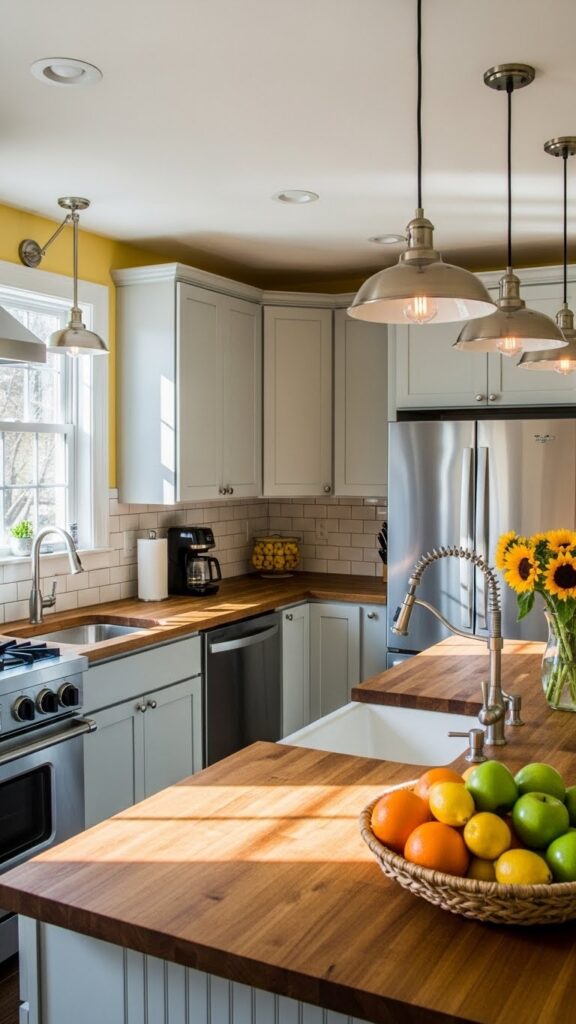
Sunny yellow walls instantly energize spaces, making them feel warm and welcoming regardless of natural light conditions. When paired with cool gray cabinetry or furniture, the combination creates perfect balance between cheerfulness and sophistication. This palette excels in kitchens, breakfast nooks, and home offices where you want to promote positive energy and productivity. The yellow stimulates creativity and optimism while gray provides calming, grounding influence.
The key to this palette is choosing the right yellow intensity. Soft, buttery yellows create gentle warmth, while brighter golden yellows make bolder statements. Gray should complement rather than compete—choose mid-tone grays that won’t look dingy against yellow walls. White trim, countertops, or backsplashes keep the space feeling crisp and clean. Natural wood elements in medium tones bridge the color temperature difference beautifully. Stainless steel or chrome fixtures enhance the modern, fresh aesthetic.
Dusty Rose and Charcoal
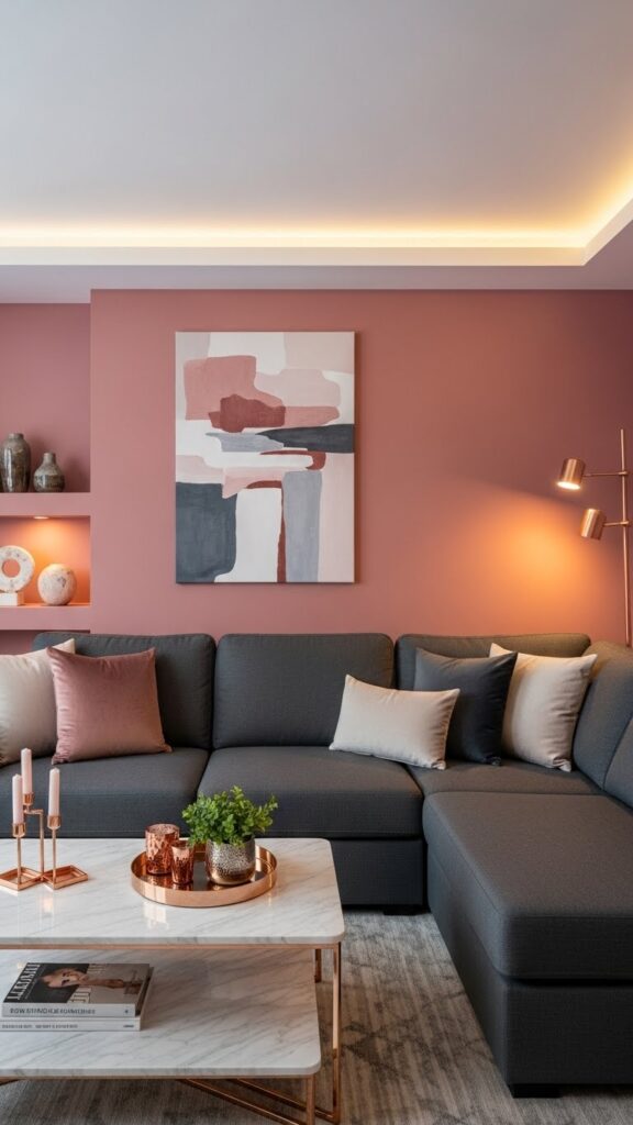
This modern palette combines romantic warmth with urban edge, creating spaces that feel both inviting and stylish. Dusty rose walls offer subtle color without overwhelming, while charcoal furniture provides striking contrast and visual weight. This combination works beautifully in living rooms, bedrooms, and creative spaces where you want sophistication with personality. The muted rose tone feels mature and refined, avoiding the sweetness of brighter pinks.
Layer this palette with varied textures to enhance visual interest—think velvet charcoal sofas against matte dusty rose walls. Rose gold, copper, or brushed brass metallic accents create gorgeous warmth that complements both colors perfectly. White or cream elements through artwork, trim, or accessories provide necessary breathing room. Marble, concrete, or stone surfaces add contemporary edge. Plants with deep green foliage pop beautifully against both dusty rose and charcoal, adding life and natural texture.
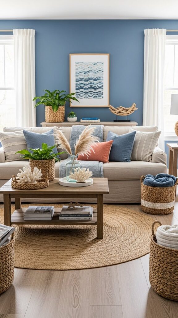
Sky Blue and Sandy Beige
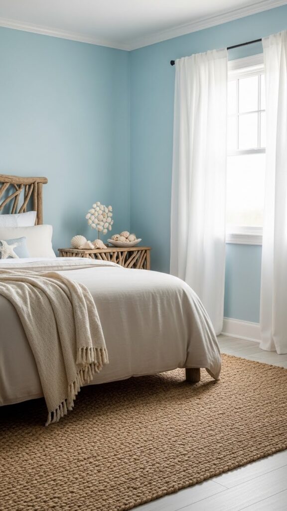
This breezy palette captures coastal tranquility, bringing vacation vibes into everyday living spaces. Sky blue walls evoke endless horizons while sandy beige grounds the airiness with warmth and texture. Perfect for bedrooms, bathrooms, and living areas, this combination creates effortlessly relaxed environments that promote calm and contentment. The light, sun-bleached quality of both colors makes rooms feel spacious and filled with natural light even on overcast days.
Enhance the coastal aesthetic with natural materials like jute, seagrass, linen, and weathered wood. White painted furniture or trim keeps the palette feeling fresh and prevents muddiness. Incorporate ocean-inspired accents through coral, shells, or driftwood pieces displayed thoughtfully. Woven textures add depth and visual interest without introducing competing colors. This palette works beautifully with both minimalist and layered decorating approaches, adapting to your personal style while maintaining its serene, beachy essence.
Deep Plum and Gold
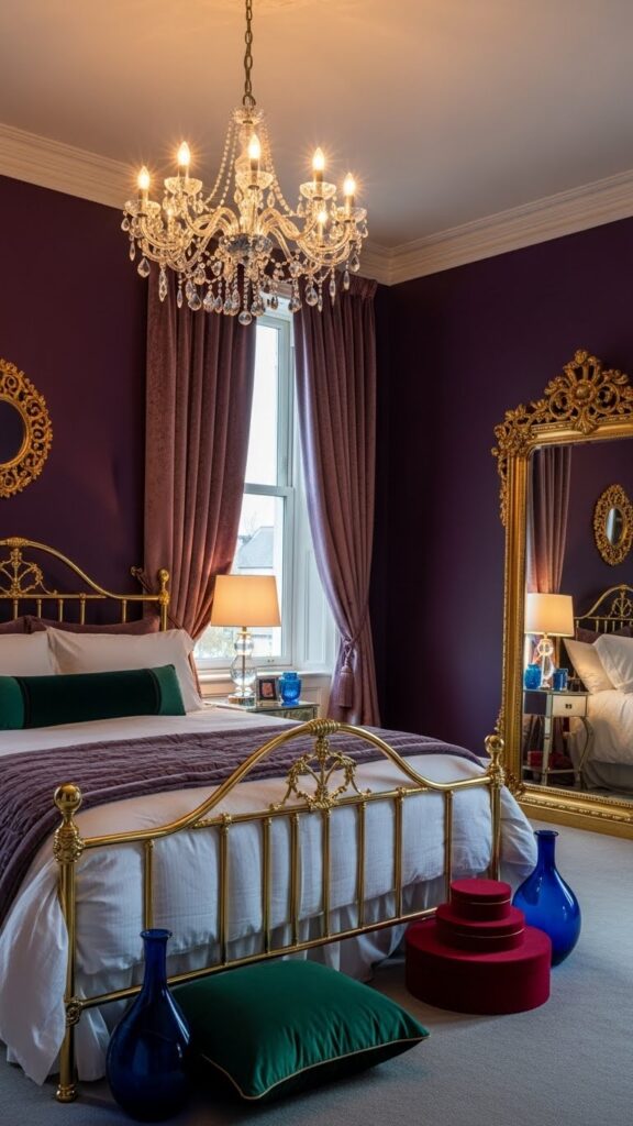
This opulent palette exudes luxury and drama, perfect for creating show-stopping spaces. Deep plum walls provide rich, enveloping color that feels both regal and intimate, while gold accents add glamorous sparkle. This combination shines in master bedrooms, powder rooms, or formal dining spaces where you want to make bold statements. The purple undertones in plum create depth that changes beautifully with lighting throughout the day and evening.
Balance the richness by incorporating plenty of cream, ivory, or soft gray elements through bedding, upholstery, or curtains. Gold works best in brushed or antique finishes rather than bright, shiny brass which can feel overwhelming. Layer various textures like velvet, silk, and faux fur for luxurious tactile appeal. Adequate lighting is crucial with deep walls—chandeliers, sconces, and table lamps create ambient glow that enhances the jewel-toned atmosphere. Crystal or glass accessories add elegant sparkle without competing.
Mint Green and Coral Pink
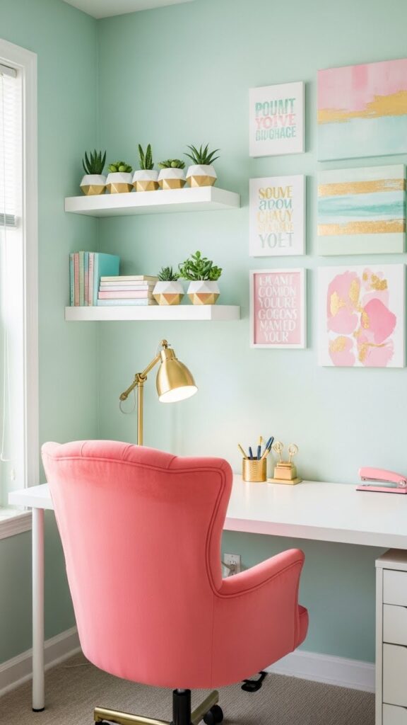
This fresh, energizing palette brings youthful vibrancy to any space without feeling juvenile. Mint green walls create a cool, refreshing backdrop while coral pink accents inject warmth and personality. This combination works wonderfully in home offices, craft rooms, or creative spaces where you want to stimulate inspiration and positive energy. The balanced contrast between cool mint and warm coral creates visual interest that feels intentional and sophisticated.
Prevent this palette from feeling overwhelming by using white or cream as a substantial third color through furniture, trim, or major elements. Gold or brass fixtures and hardware add warmth that complements the coral beautifully. Natural wood in light finishes helps ground the brighter colors. Introduce patterns that incorporate both colors for cohesive flow—geometric prints, florals, or abstract designs work particularly well. This palette provides the perfect foundation for displaying colorful artwork, books, and creative supplies.
Mocha Brown and Cream
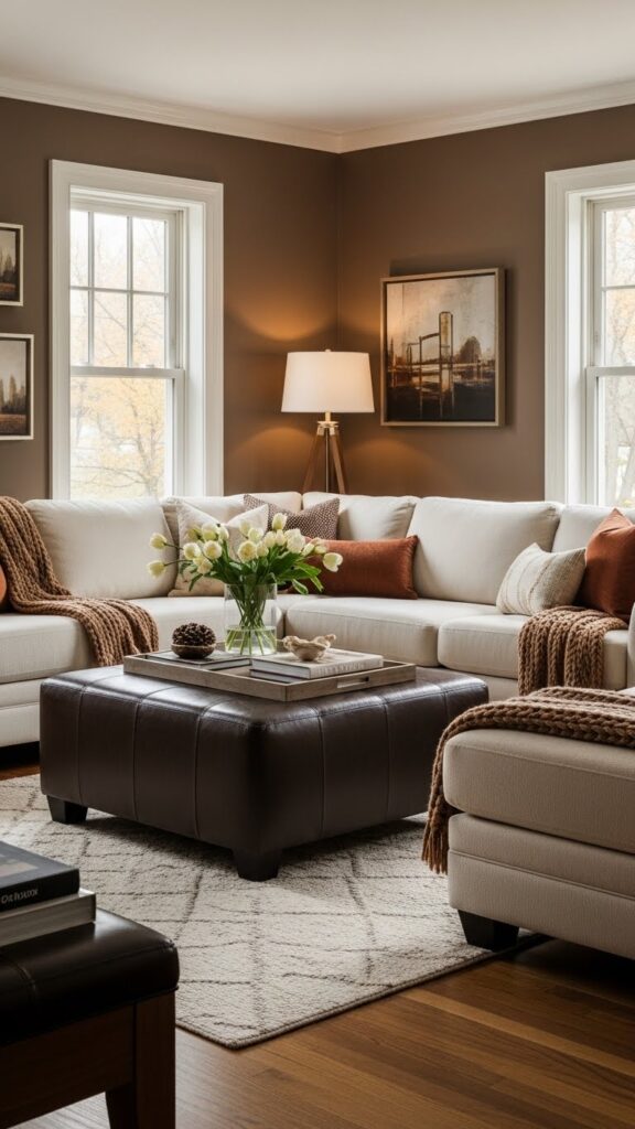
This warm, comforting palette creates instantly inviting spaces that feel like a warm embrace. Mocha brown walls provide richness without the heaviness of darker browns, while generous cream elements keep spaces from feeling closed in. Perfect for living rooms, dens, and family spaces, this combination promotes relaxation and togetherness. The chocolate undertones in mocha create depth that pairs beautifully with various wood tones and natural materials.
Layer this monochromatic palette with varied textures to prevent flatness—think chunky knit throws, leather furniture, linen curtains, and velvet pillows. Warm metallics like bronze, copper, or antique brass enhance the cozy atmosphere. Introduce deeper browns through accent furniture or wood pieces for added dimension. Greenery pops beautifully against mocha walls, adding life and freshness. This palette creates the perfect backdrop for displaying warm-toned artwork, family photos, and treasured collections throughout your space.
Slate Blue and Mustard
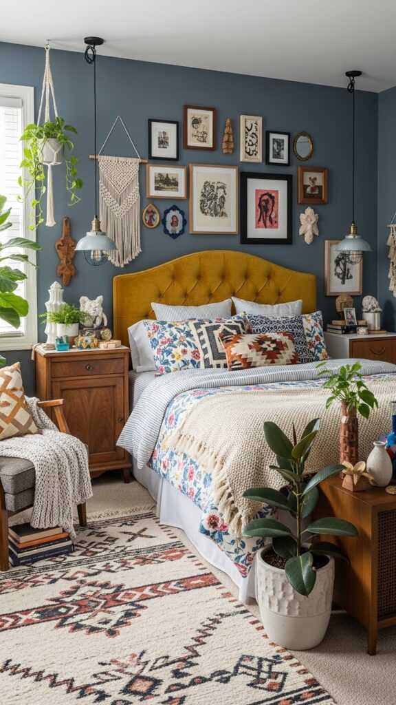
This unexpected combination balances cool sophistication with warm energy, creating dynamic spaces full of personality. Slate blue walls offer depth and interest without the drama of navy, while mustard yellow accents provide cheerful contrast. This palette works beautifully in bedrooms, creative studios, or eclectic living spaces where you want to express individuality. The muted quality of both colors keeps them from competing, creating harmony despite their contrast.
Successfully working with this palette requires thoughtful distribution of both colors. Use slate blue dominantly on walls with strategic mustard pops through furniture, textiles, or artwork. Cream or warm white elements provide necessary visual rest and prevent overwhelm. Natural wood in medium to dark tones bridges the color temperatures beautifully. Brass or gold fixtures complement the mustard while adding refinement. This combination pairs wonderfully with vintage finds, global textiles, and collected treasures.
Warm Taupe and White
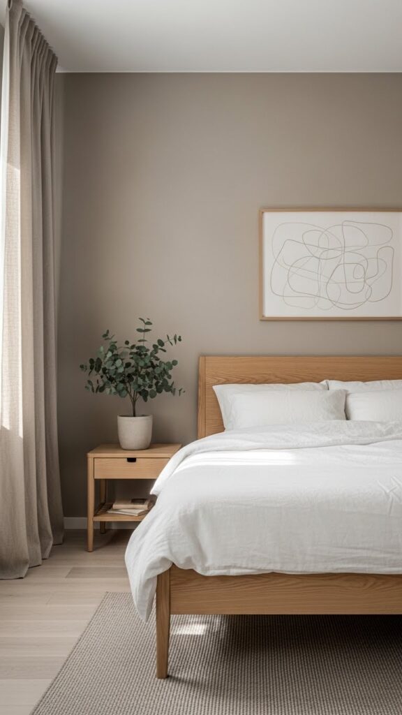
This sophisticated neutral palette creates serene, timeless spaces that never feel cold or boring. Warm taupe walls provide subtle color that works as a neutral while adding more interest than standard beige or gray. Crisp white elements through bedding, trim, and furniture create fresh contrast. This combination excels in bedrooms, bathrooms, and minimalist spaces where calm and clarity are priorities. The warmth in taupe prevents spaces from feeling clinical or stark.
This palette provides the perfect foundation for layering natural textures and materials. Incorporate linen, cotton, wool, and jute through textiles and rugs for tactile interest. Light to medium wood tones in oak, ash, or maple enhance the warm, organic feel. Matte black or warm brass hardware adds subtle accent points without disrupting the serene atmosphere. This neutral backdrop allows you to rotate accessories and accents seasonally without needing to repaint, offering flexibility while maintaining sophisticated simplicity.
Peacock Blue and Gold
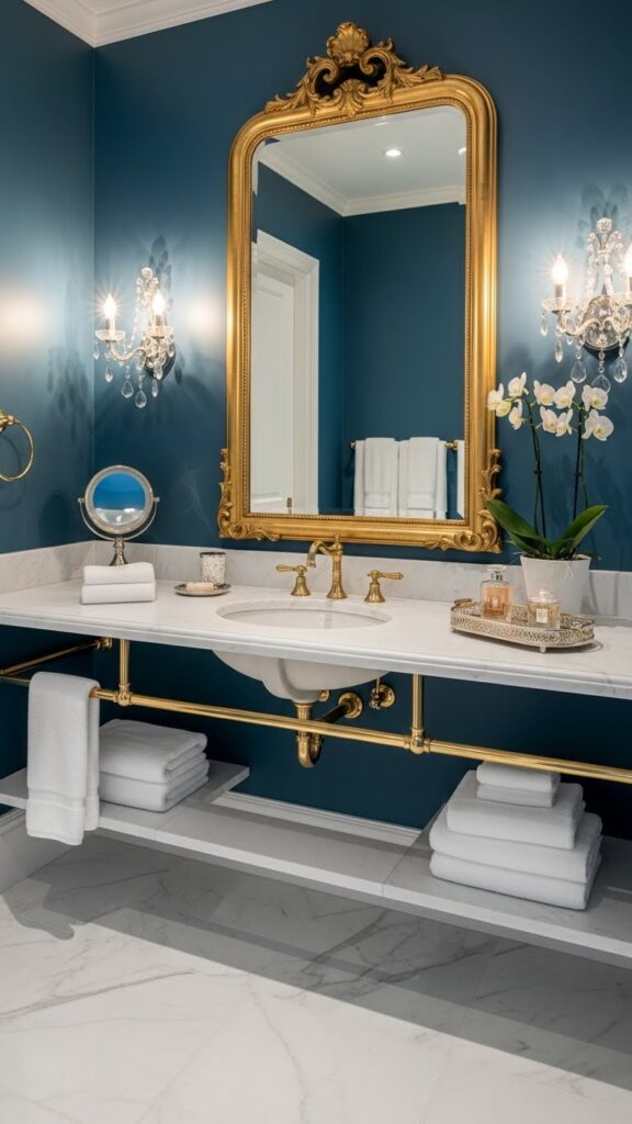
This jewel-toned palette radiates luxury and creates stunning, memorable spaces. Peacock blue walls offer vibrant sophistication with green undertones that feel both bold and refined. Gold accents provide warm glamour that elevates the richness of the blue. This combination works exceptionally well in powder rooms, dining rooms, or accent walls where you want maximum impact. The depth of peacock blue creates intimate, enveloping environments perfect for special occasions and entertaining.
Balance the intensity with generous white or cream elements through furniture, countertops, or major fixtures. Gold is most effective in brushed, satin, or antique finishes which feel more refined than bright brass. Marble, particularly white with gold or gray veining, pairs exquisitely with this palette. Crystal or glass accessories add sparkle without competing. Ensure excellent lighting to showcase the blue’s complexity—it appears different under natural light versus evening illumination, revealing beautiful depth and dimension.
Soft Peach and Gray Green
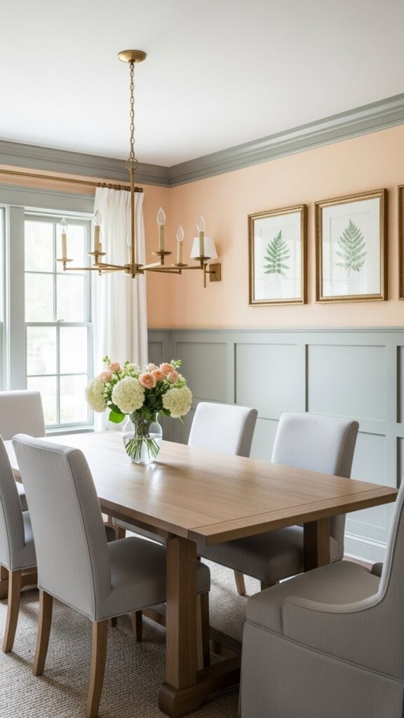
This gentle, nature-inspired palette creates sophisticated spaces that feel both fresh and timeless. Soft peach walls provide warmth with subtle color that flatters skin tones and creates welcoming environments. Gray-green accents add grounding coolness that prevents the peach from feeling too sweet. This combination works beautifully in dining rooms, bedrooms, and living spaces where you want elegance without formality. Both colors have complexity that reveals different facets as light changes.
The key to this palette is choosing the right undertones—peach should lean toward coral rather than orange, and green should be muted and grayed rather than bright. Cream or ivory trim ties both colors together seamlessly. Natural wood in light to medium tones enhances the organic feel. Brass or copper fixtures add warmth that complements the peach beautifully. Layer in botanical elements through artwork, fresh flowers, or plants to reinforce the nature-inspired aesthetic and add visual interest.
Denim Blue and Natural Linen
This casual, approachable palette creates effortlessly comfortable spaces perfect for everyday living. Denim blue walls offer color personality while maintaining versatility and livability. Natural linen elements through furniture and textiles add organic warmth and texture. This combination excels in family rooms, casual living areas, and bedrooms where relaxed comfort is priority. The medium blue provides enough interest to avoid blandness while remaining neutral enough for changing decor over time.
This palette thrives with natural materials and casual textures—think jute rugs, woven baskets, weathered wood, and plenty of soft textiles. White or cream accents keep the space feeling fresh and prevent the blue from feeling heavy. Warm wood tones in oak, pine, or reclaimed finishes enhance the laid-back aesthetic. Nickel, pewter, or matte black hardware provides subtle contrast without fussiness. This combination creates the perfect backdrop for family life, embracing both style and practicality.
Blush and Sage Two-Tone
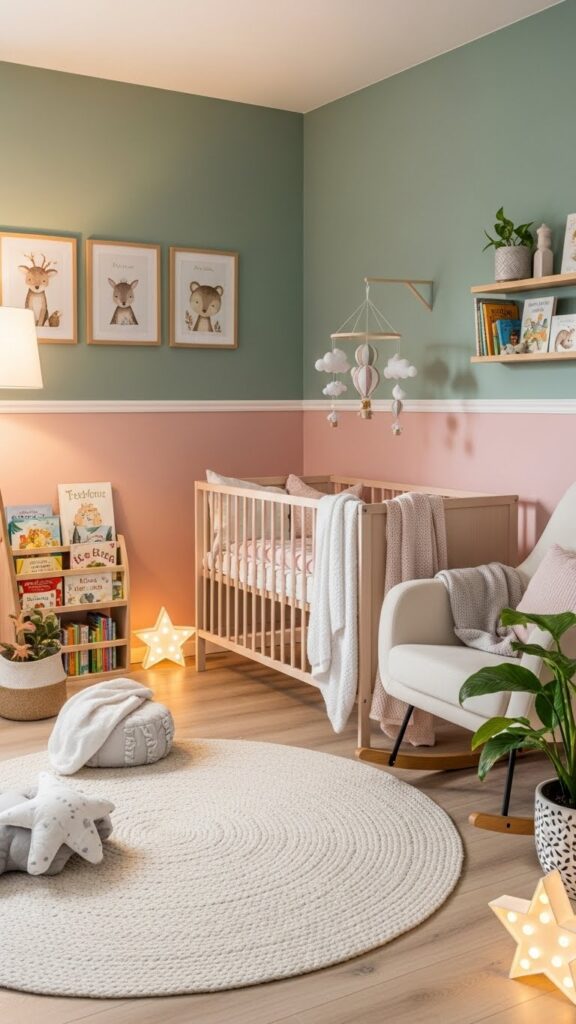
This charming two-tone approach combines the softness of blush with the calm of sage in one cohesive palette. Using both colors on walls separated by trim creates visual interest and definition without needing bold colors or patterns. This combination works wonderfully in nurseries, children’s rooms, or small spaces where you want gentle color without overwhelming. The division of colors adds architectural interest to rooms lacking traditional molding or architectural details.
Balance the two-tone approach by keeping other elements relatively simple and neutral. White or cream furniture prevents the space from feeling too colorful while letting the walls shine. Natural wood accents warm the palette and add organic texture. Choose one color for larger textiles like curtains while using the other for accent pillows or smaller items. Soft metallics in brushed gold or rose gold complement both colors beautifully. This palette grows with children, remaining appropriate through different developmental stages.
Conclusion
Selecting the perfect wall color palette transforms houses into personalized homes that reflect your unique style and enhance daily living. These twenty-two combinations offer diverse options ranging from bold and dramatic to soft and serene, ensuring there’s inspiration for every taste and space. Remember that successful color palettes extend beyond walls—they’re brought to life through thoughtful layering of textures, materials, and finishes that create cohesive, beautiful environments.
When choosing your palette, consider how natural light interacts with your space throughout the day, the mood you want to create, and which colors make you feel most at home. Don’t be afraid to test paint samples on your walls and live with them for several days before committing. The most important rule is choosing colors that bring you joy and create spaces where you love spending time. With these inspiring palettes as your starting point, you’re ready to create the stylish, welcoming home you’ve always envisioned.